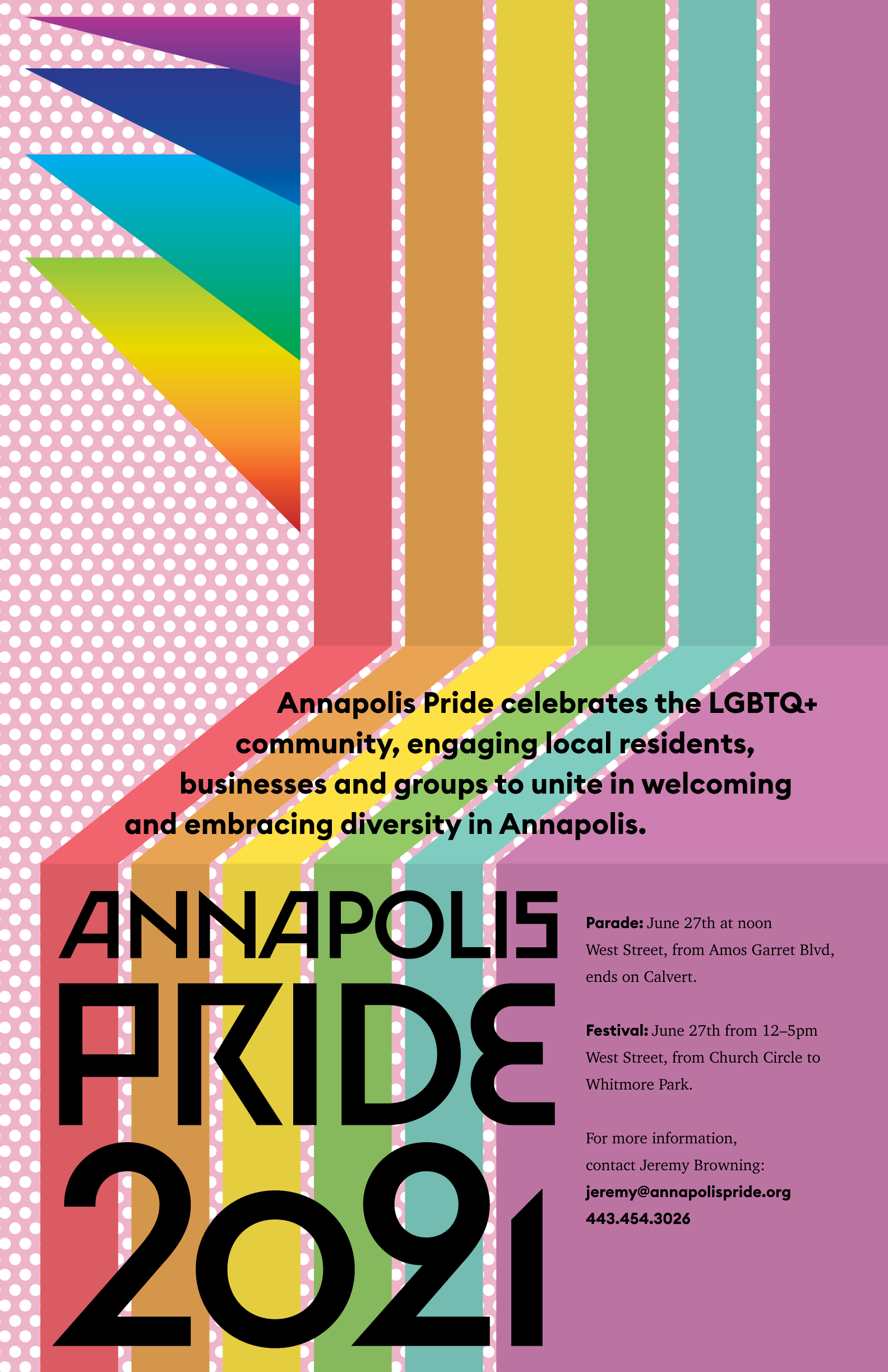
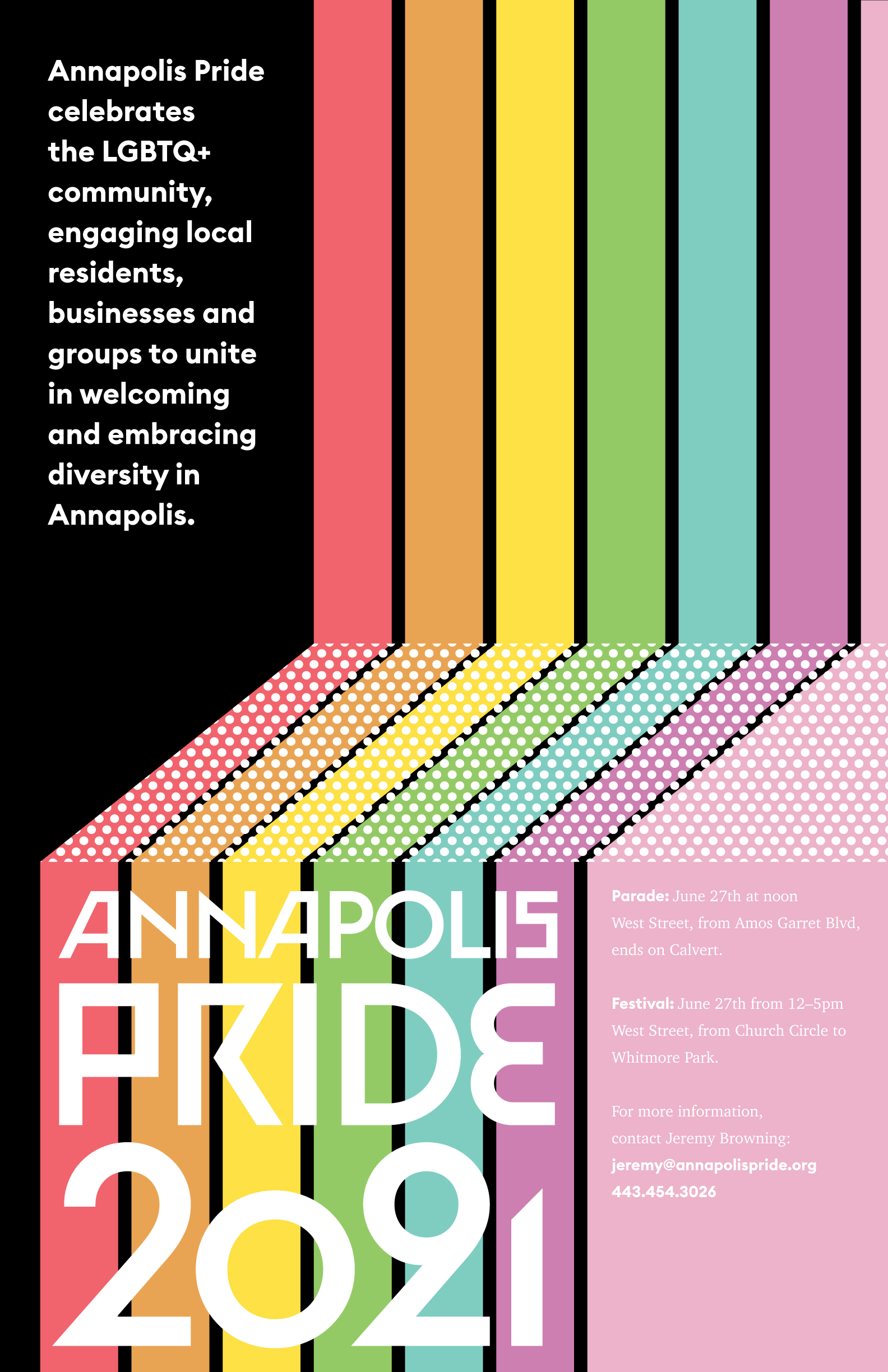
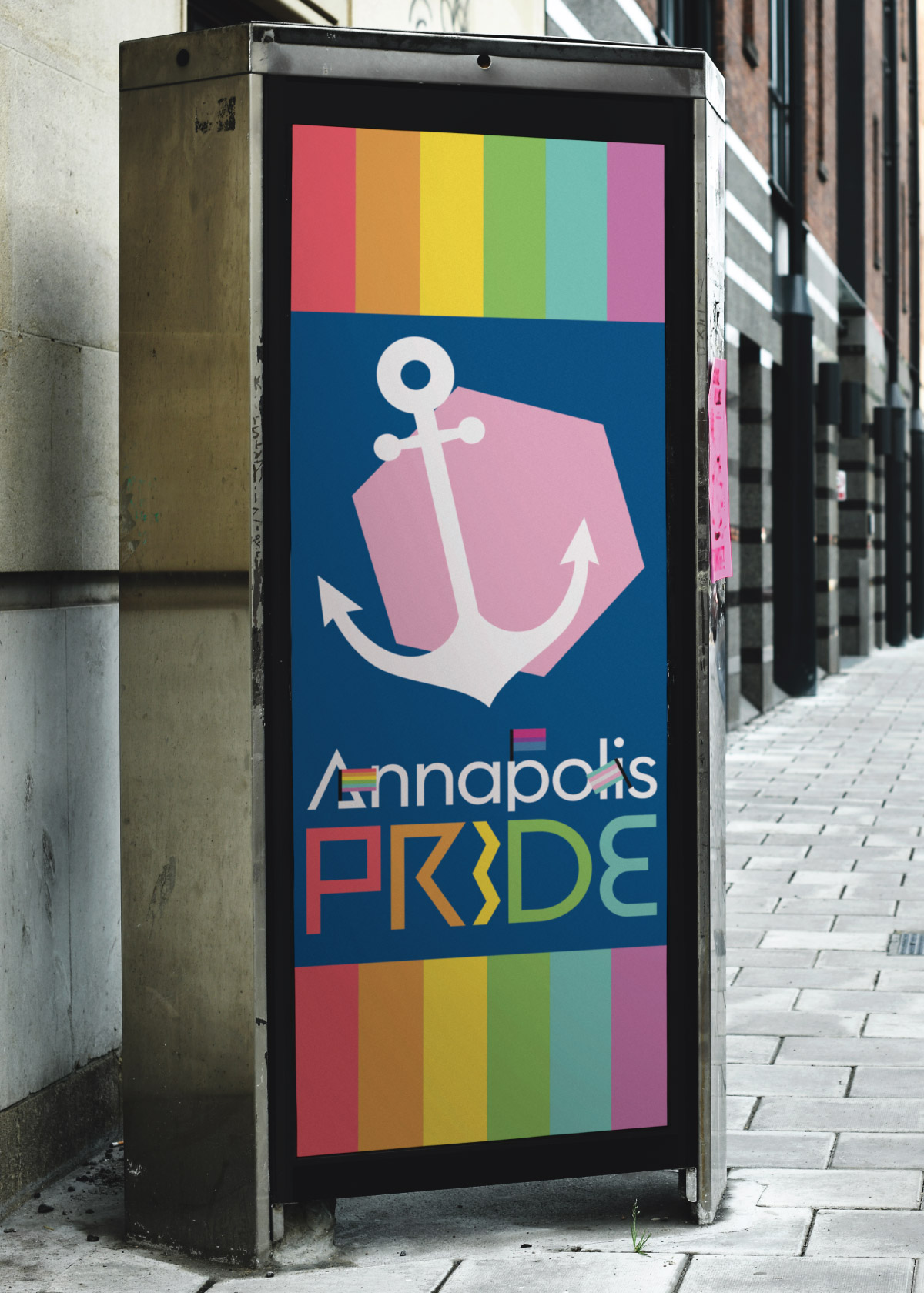
Ashlyn Poole

Branding

Annapolis Pride

The Annapolis Pride logo, featuring letters with small 'arms' holding tiny pride flags.

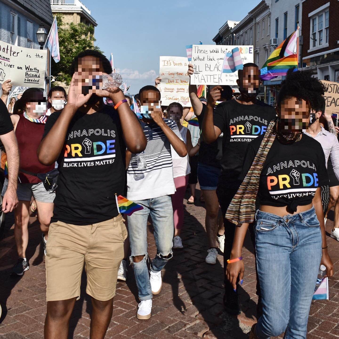
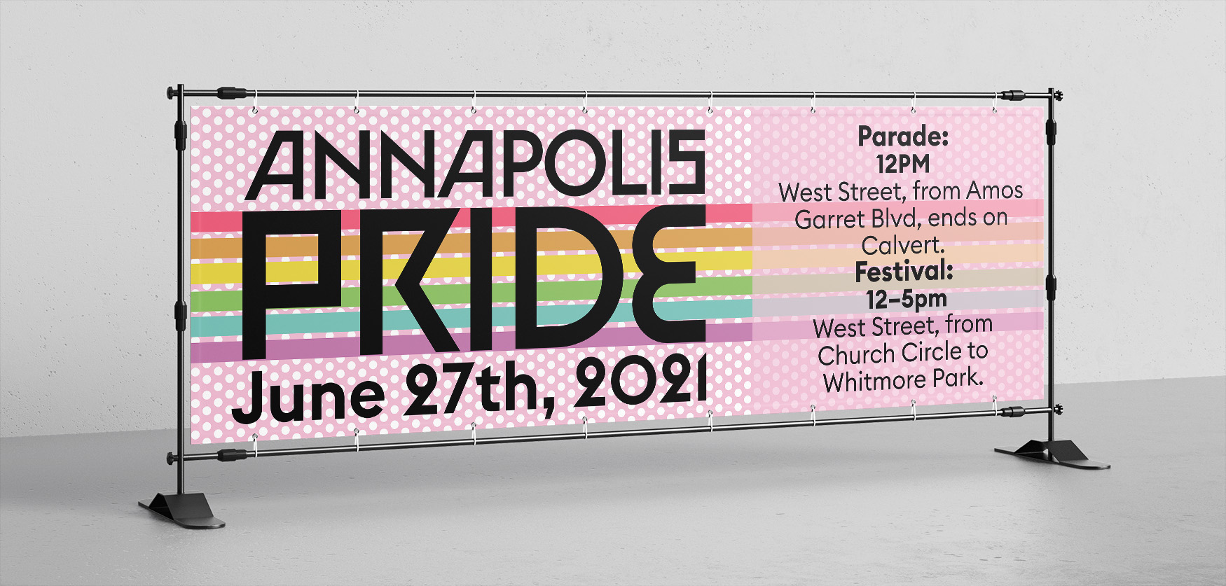
Annapolis Pride is a fairly new startup. Their goal is to hold events that bring the local LGBTQ+ community together, as well as bring awareness of the issues we face to those outside of our community. One of their largest events is the annual Pride Festival, which is held in Downtown Annapolis. It is primarily a family event, though the event is ultimately for everyone who identifies as LGBTQ+, as well as our allies. I've proudly been volunteering and freelancing for them since their inception in 2018, and have had many oppertunities to do both exploratory work for my portfolio, as well as to design real-world deliverables for them.

Some items on this page were designed alongside Fern Hassan.

Some navigational icons I designed. They are simple black lines, with a splash of color behind each. They were designed to have a nautical theme, to match the local's love of boats in Annapolis. There is a book for collaborative events with the local library system, a pipe for marking smoking zones, a mug of frothing beer for twenty-one plus events, a handful of coins to mark collaborating shops, a trident and knife to represent the well-recognized fork and knife symbol for dining, and the Annapolis Pride anchor to represent official events.

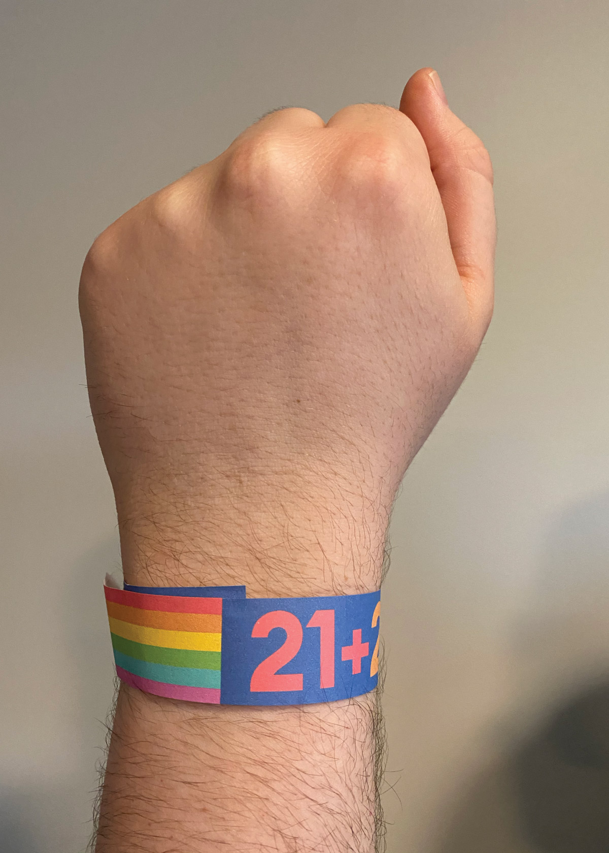
As part of our brand exploration, we designed this set of nautically themed wayfinding icons that could be used to help an individual navigate the festival through maps and signage. Featuring a book for collaborative events with the local library system, a pipe for marking smoking zones, a mug of frothing beer for 21+ plus events, a handful of coins to mark collaborating vendors, a trident and knife taking the place of a traditional fork and knife symbol for dining, and the Annapolis Pride anchor to represent official events.

A branded pattern, featuring red polkadots.
A branded pattern, featuring colorful 'waves' with white in between.
A branded pattern, featuring colorful 'hills' knit closely together.
A branded pattern, featuring red polkadots.

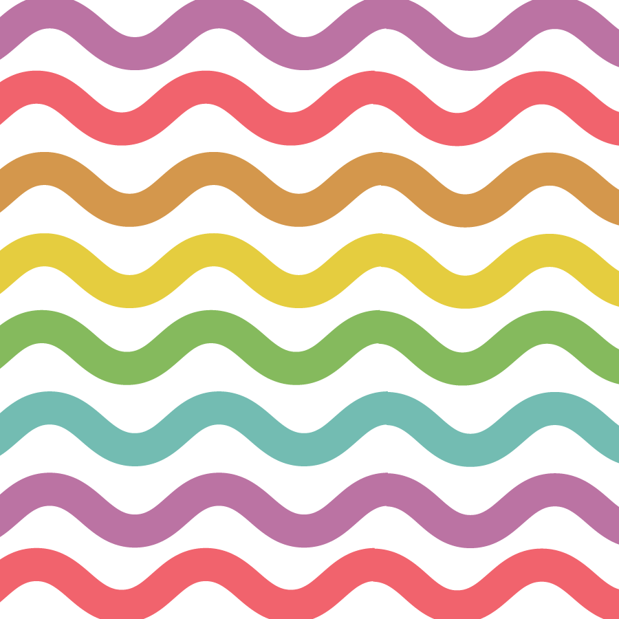
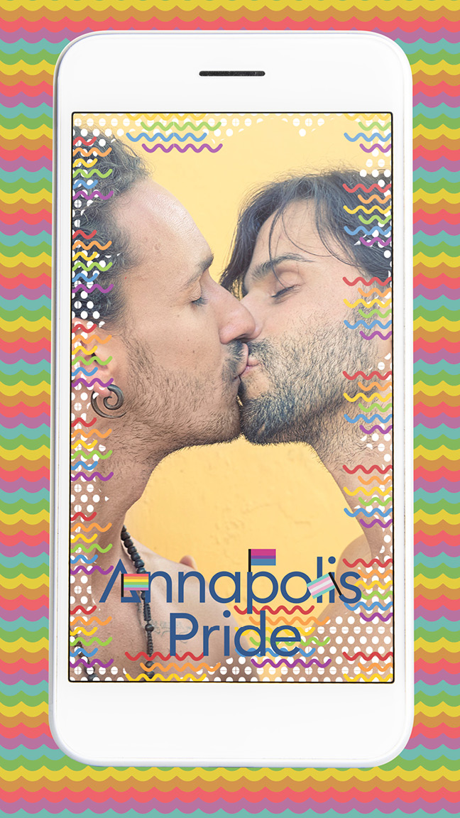
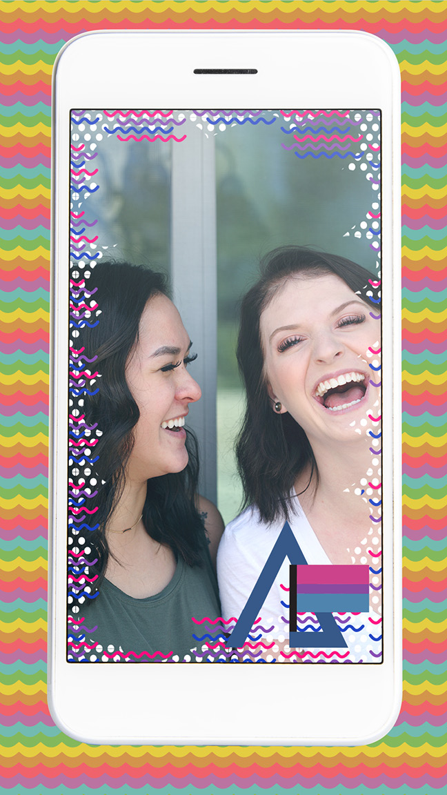
We also created a set of patterns that could be used throughout the brand, as background and textural elements throughout our designs. We prominently feature these rainbow "waves" throughout our branding.

The Annapolis Pride logo, without the decorative text of their standard logo, and with only one pride flag on the first letter.
The Annapolis Pride logo, featuring letters with small 'arms' holding tiny pride flags.

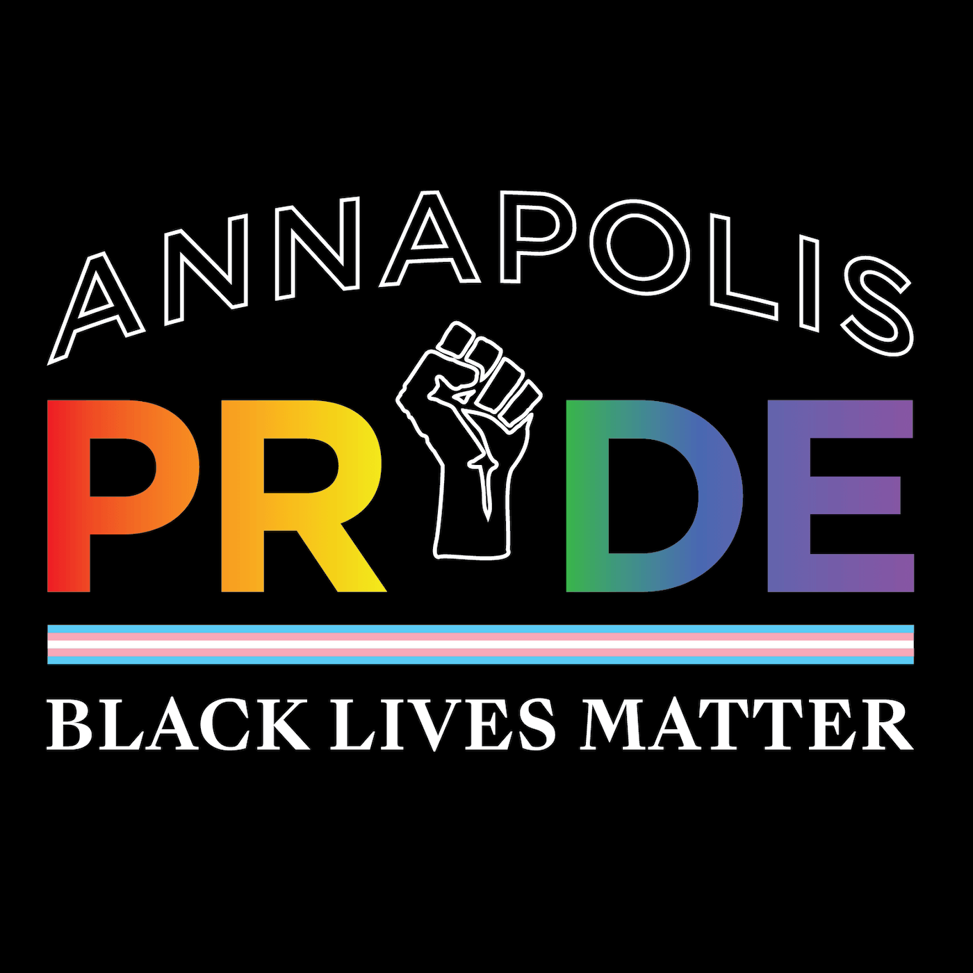
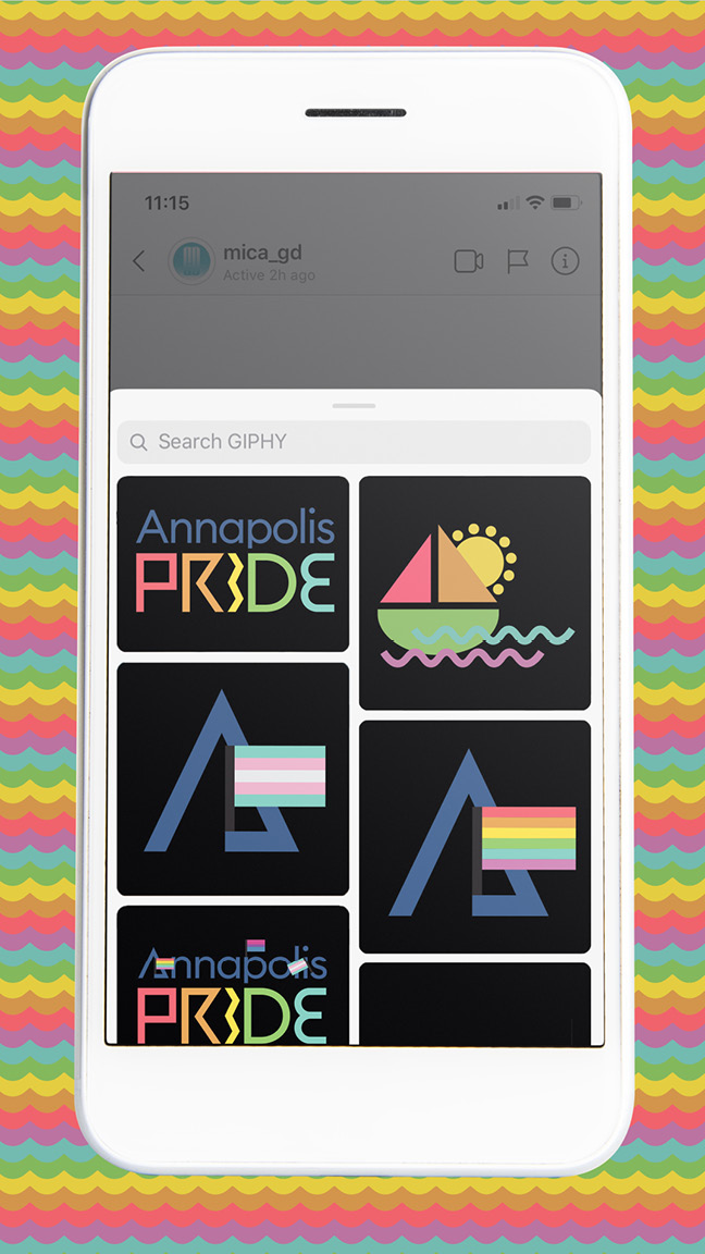
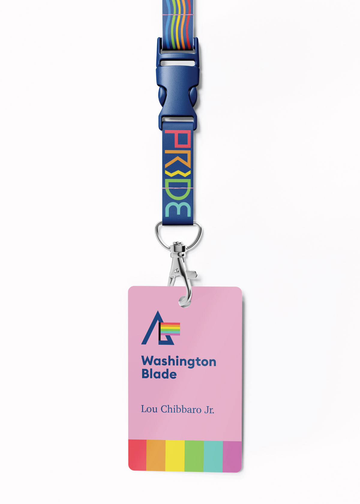
Lastly, we created variations of the final logo, both for smaller iconographic format, as well as a more formal variant that could be used in more traditional settings such as fundraising. Annapolis Pride, like many non-profits, has to play a role in both the community as well as the corporate world.

A poster annoucing the parade and festival, featuring a stair step affect rainbow, with a flat plane in the middle of an otherwise uninterrupted stream from the top to bottom of the design. TThe backdrop is bright pink with a white dot pattern.
A slightly different variation of the previous poster, featuring a stark black background, with the same white dot pattern on the flat section of the rainbow instead.
An image of a Black Lives Matter protest in Downtown Annapolis during the summer of 2020. Some participants are wearing a shirt I designed.
A close-up view of the t-shirt graphic from the previous image. It features a similar appearance to the other branded elements, but without the same playfulness. The 'I' in Pride is replaced with the black power fist, and the words 'Black Lives Matter' are below the logo. In between the logo and this text is a dividing stripe made from the trans pride flag.
The Annapolis Pride logo, featuring letters with small 'arms' holding tiny pride flags.
A phone, featuring an image filter of the gay pride flag overlaid on top of an image of two men kissing.
A phone, featuring a GIPHY search with various branded Annapolis Pride stickers available to share with your friends.
A phone, featuring an image filter of the bisexual pride flag overlaid on top of an image of two women laughing together.
A mockup of what a bus advertisement might look like. It features the anchor icon from earlier on a hot pink backdrop, which is sitting on a navy blue background. Our Annapolis Pride logo is below, and there is a rainbow frame on the top and bottom of the sign.
A mockup of what a pressbadge might look like. It features a navy blue lanyard with rainbow text and a wavy pattern, and a bright pink card is attached with the name of the news organization and reporter on it. A rainbow stripe sits on the bottom of the card.
A photo showing what a twenty-one plus barhopping wristband might look like. I printed and wrapped this around a real wrist for this images, and the wrist is pointing upward in a 'resistance' pose. The wristband is navy blue, with the numbers twenty-one and a plus sign repeating across the band in various rainbow colors. The section over the taped part of the band is decorated as a pride flag.