Database Memorial
This was a two part, semester-long project for a generative typography class: a technically oriented typeface design, and a conceptual application of that design as a part of a generative artwork. My goal for this first step was to design a typeface entirely using Javascript code. I used the p5.js library extensively throughout this project.
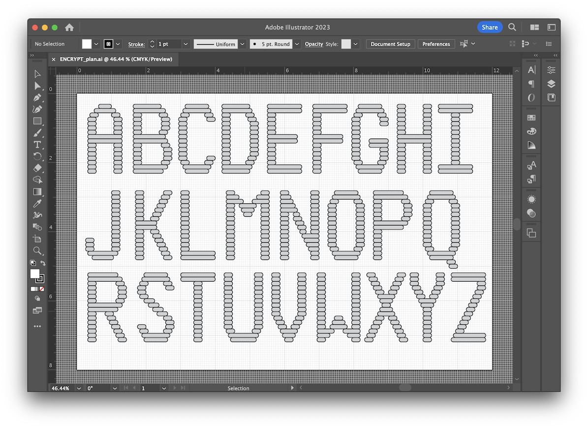
Before I began to code the final typeface, I mapped out a blueprint for the letterforms based on a shape I knew was easily drawn, repeatable, and simple to manipulate. While there are some minor variances in the final design (most notable in the lower corner of the N), this blueprint would end up as more or less final.
I named the typeface "Encrypt," as I thought it carried a bit of a cyberpunk retro aesthetic. I initially toyed with a green aesthetic, but this did not suit the serious tone of the final design. Once the above proof of concept was coded featuring increasing widths, I began to build the final design, featuring a variable width setting for both the left and right sides of each character.
I knew early on that if I planned to randomize color output, I had to be careful to keep things in a cohesive range or else things would quickly get out of hand. I explored what it might look like to contain the variables to different limits, and ended up with a somber color scheme I liked that would fit the final design—built using two color variables for the red and blue values inside the RGB color space.
For part two of our assignment, I was asked to use my typeface as an element of a generative design using an external source of data. I chose to use the Washington Post's Police Shootings Database for my project. Since 2015, they have kept a list of every fatality caused by a police officer in the line of duty. When I initially pulled the data in May of 2021, 6,211 people had been killed. They track the name, age, location, and race of the deceased, as well as the exterior circumstances of the shooting, such as whether the person was armed, attempted to flea, or showed signs of a mental health episode.
I explored different ways to present this data through quick experiments. In the prototype above, I wanted to highlight just how few of these deaths were filmed with bodycam footage, meaning we have no story other than the official narrative as given by the officer responsible. When the background is white, there is known bodycam footage of the event.
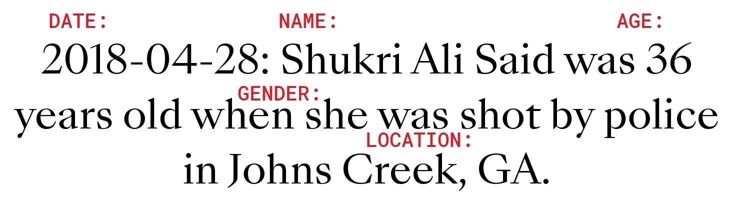
Integrating data as personal as this into a project like this has huge implications. I began to approach this data cautiously, figuring out how I wanted to represent the individuals who were involved in the most respectful way I could manage. I chose their name, age, and gender identity, as well as the date and location of the event. The Washington Post uses this database to map out an epidemic, showcasing the nature of police brutality on a macro scale. I decided that I wanted to show the individuals who were direct victims.
My intent with the final poster generated above is to memorialize individuals. It selects from the database at random, choosing people who died at the hands of police violence. It is indifferent to the official police story, ignoring factors such as whether or not the person fled or was armed. It simply acts as a memorial to lost lives. It uses somber colors in honor of those who were killed, and features two panels: a side column that lists names on their own, and a list of individuals and their final moments.