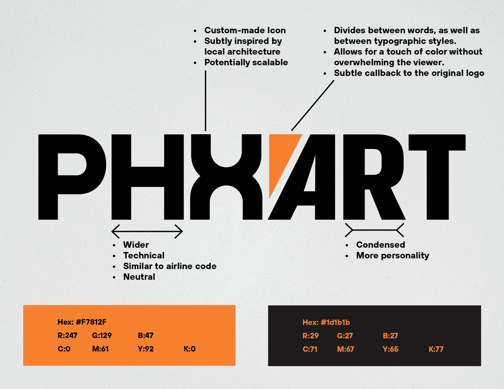
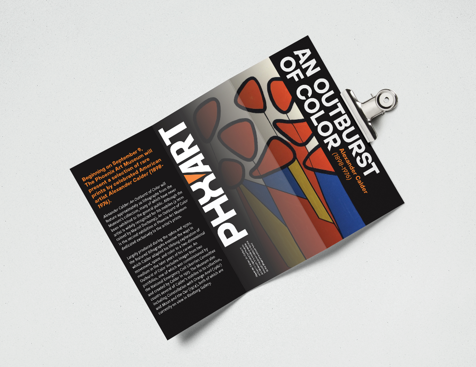
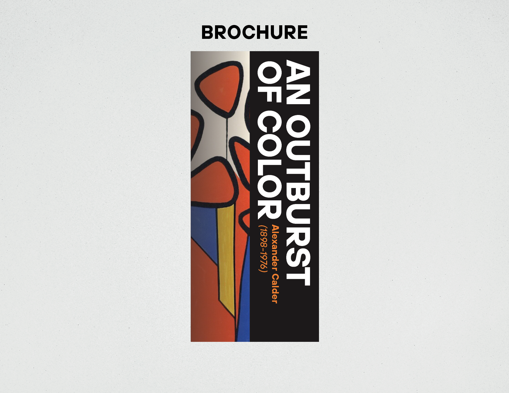
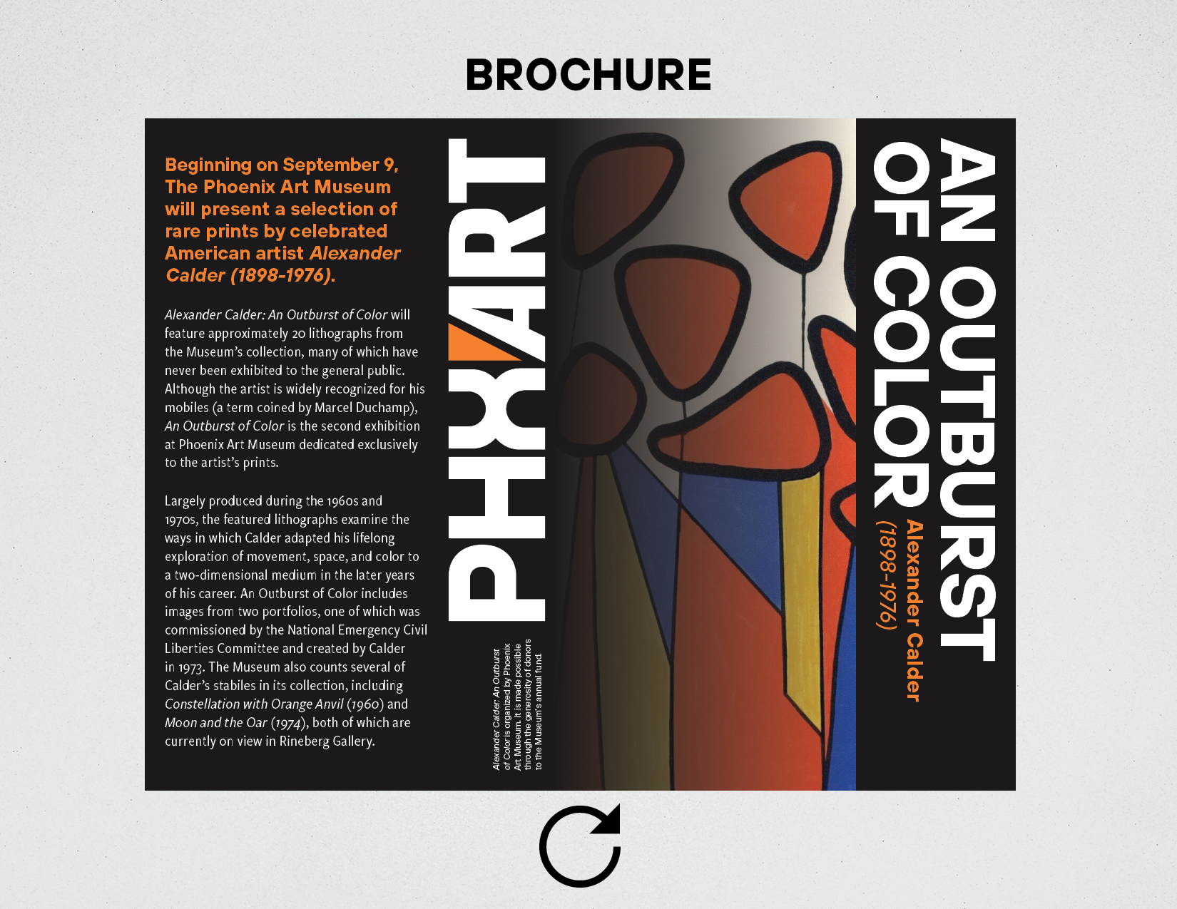
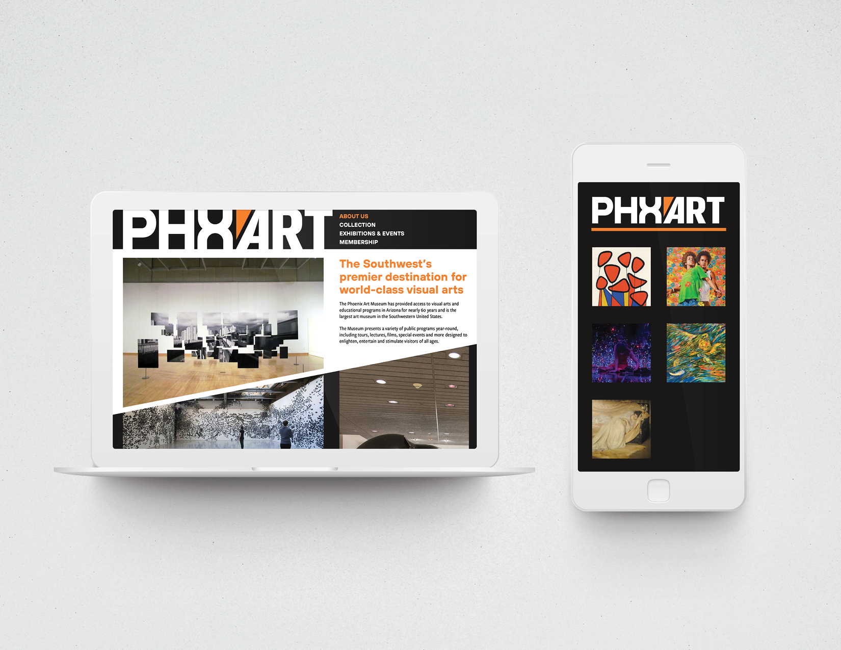
Ashlyn Poole

Branding

PHXART

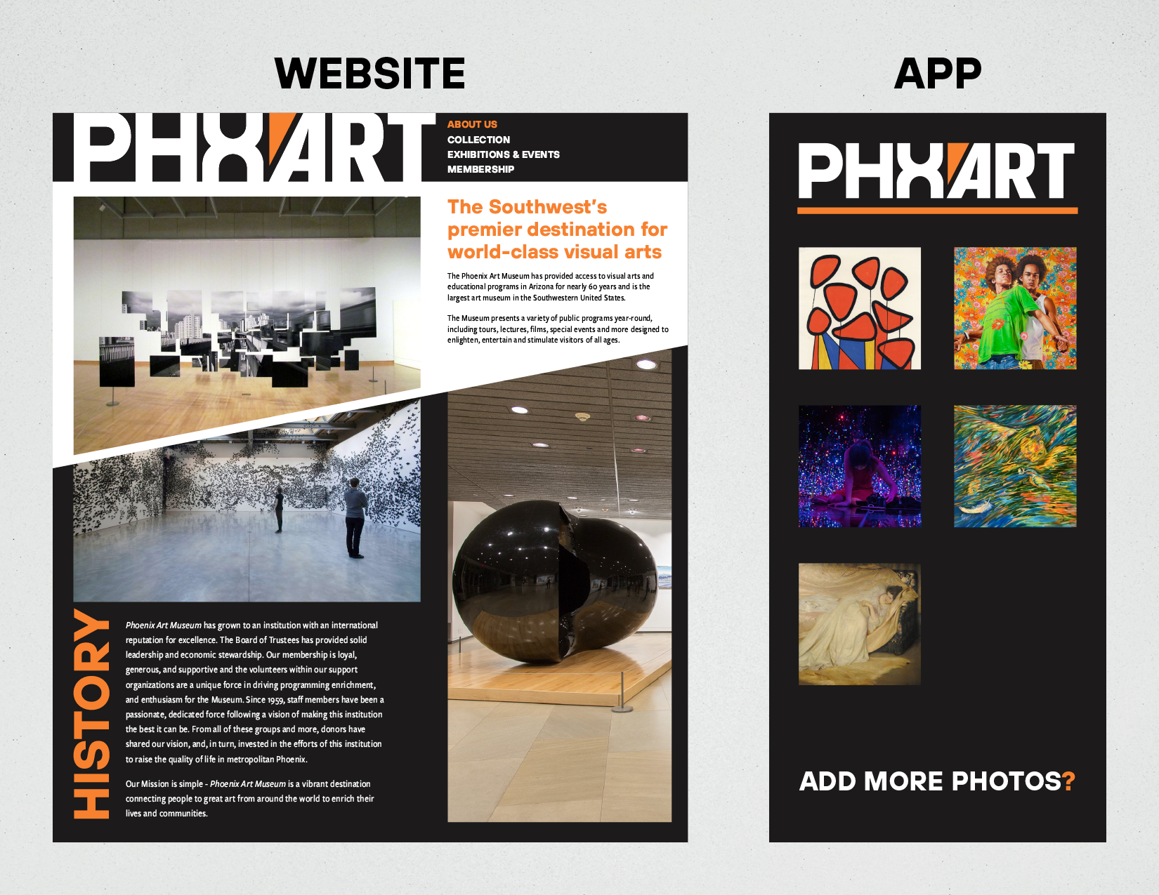
Created during a branding workshop with Andrew Walters. My goal with this rebrand was to take a fairly stagnant and outdated brand and incorporate a more clean, bold and welcoming touch to it. I chose to rebrand the Phoenix Art Museum because I am a huge fan of their institution, but not of their branding. To demonstrate my rebrand, I created a brochure that you might pick up inside an exhibit space, as well as a new website and mobile app.

The Phoenix Art logo on a dark colored backdrop. It is created out of multiple different fonts with a similar appearance so it appears modern but with a playful twist to it. There is an orange wedge between the words, intended as a callback to the current Phoenix Art Museum logo.
A spec sheet that goes over the brand colors I've chosen (a bright vibrant orange, and a dark muted orange black), as well as giving some context into the logo itself such as how it is inspired by the architecture of the city of Phoenix.
A brochure mockup, hung sideways on a wall. It shows my brand in use for an Alexander Calder exhibit. The brochure features bright, colorful and bold typography on a dark colored background. There is an image of Calder's work fading into the brochure between the front and center fold.
One out of four slides I created to showcase how the brochure would unfold.
Two out of four slides I created to showcase how the brochure would unfold.
Three out of four slides I created to showcase how the brochure would unfold.
Four out of four slides I created to showcase how the brochure would unfold.
The Phoenix Art website shown on a mockup of a laptop, with the Phoenix Art app shown on a phone next to it.
The same website and app, but shown without the mockup.