Accessibility Handbook
It was hard on my family when my brother went from working a job to suddenly being unable to finish a shift on his feet. Sudden onset disability has a way of really changing how you see the world around you.
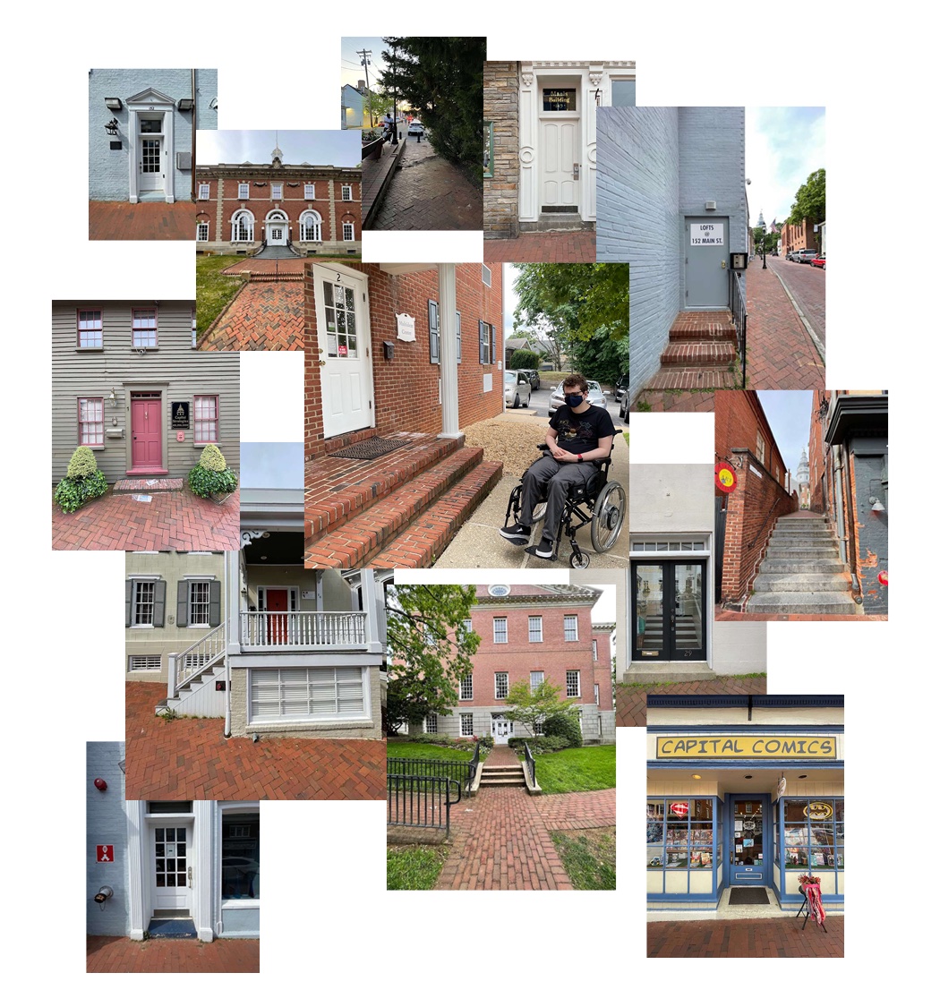
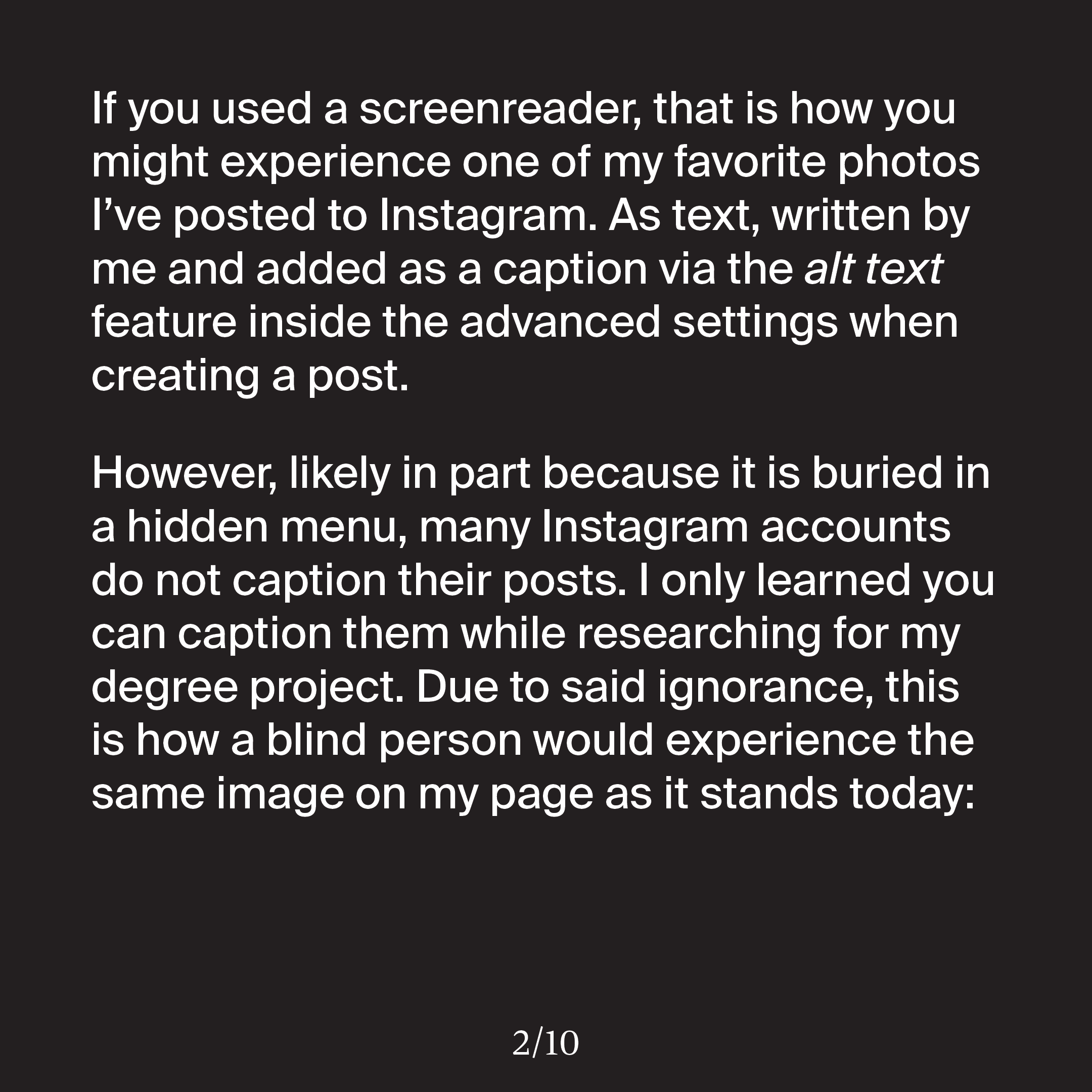
Many of the buildings in Annapolis have historic status, meaning they are allowed to be inaccessible, and advocates for change frequently run into issues with the local Historic Preservation Commission whenever they seek to improve accessibility in the city. This makes my brother, and countless others, feel left out of the world, and has become such an issue that my family’s decision on whether or not to go to a business now depends on whether or not he can even enter.
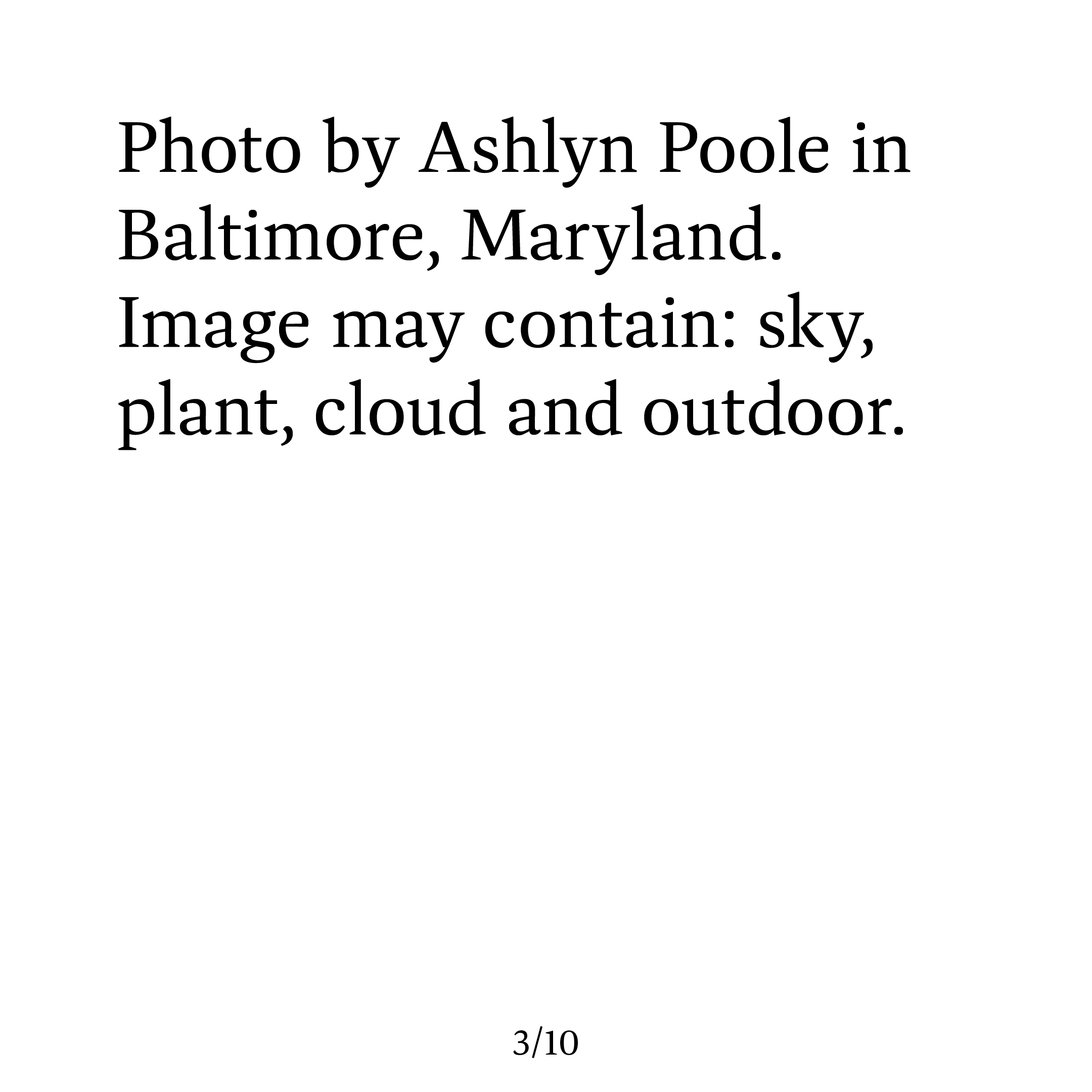
For these reasons, this was a very personal project for me to take on. I wanted to learn what had gone wrong, and advocate as well as possible for improvements, both in my local design community as well as at a state level.
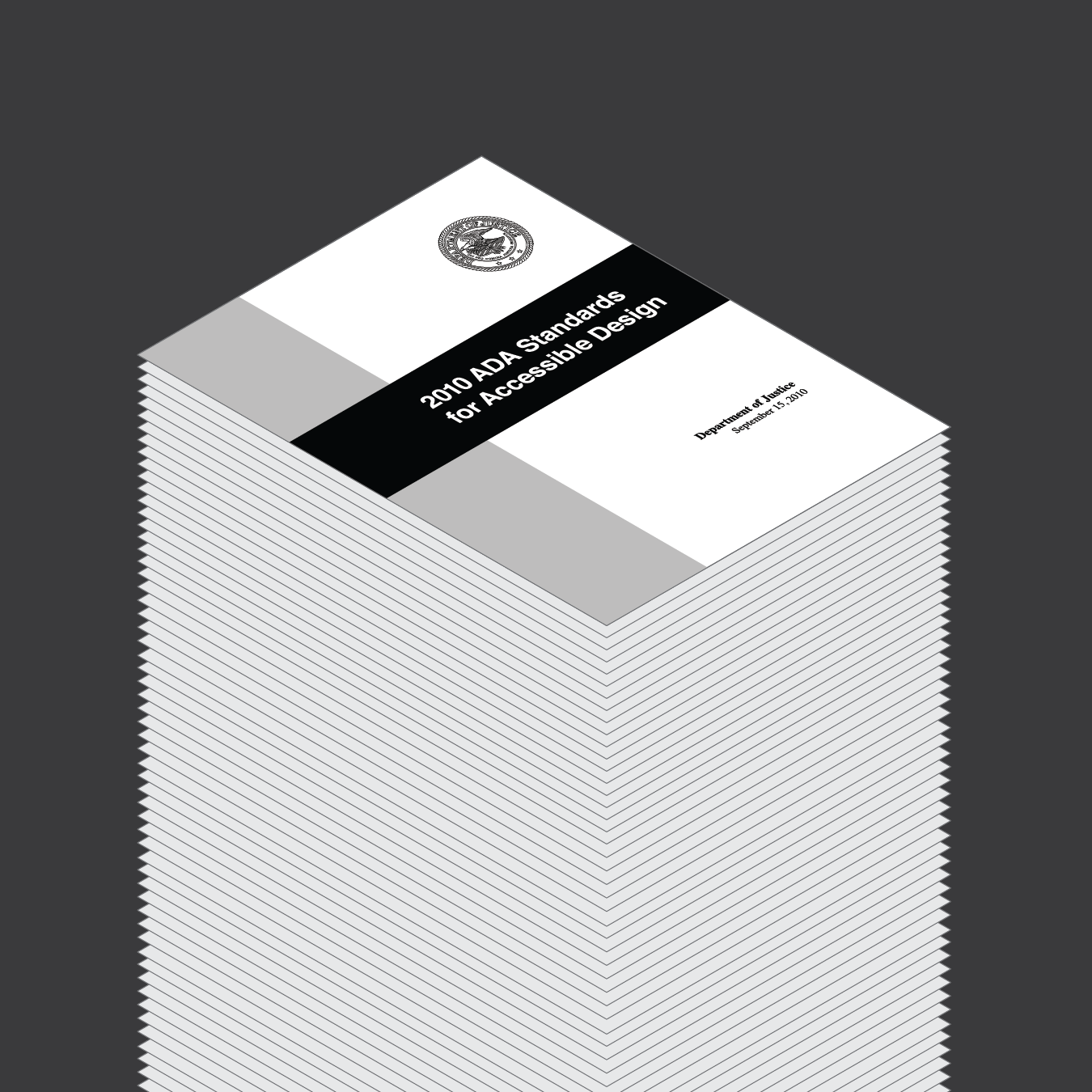
The 2010 ADA Standards for Accessible Design is a 275 page document—an amount of pages few creative people will realistically read and take to heart. There are ten full chapters in this document. Much of the focus is on spatial design rather than visual design.
If you require a higher education and full mastery of the English language to even understand a set of guidelines, they will never be universally applied. I also don’t really like the standards. Even when applied, I don't feel that they do enough to truly make a difference. Here are a few examples:
The ADA Standards have not been updated since 2010. A lot has changed in that time. It wasn’t until 2012, two years later, that Google Chrome overtook Internet Explorer as the most used web browser.
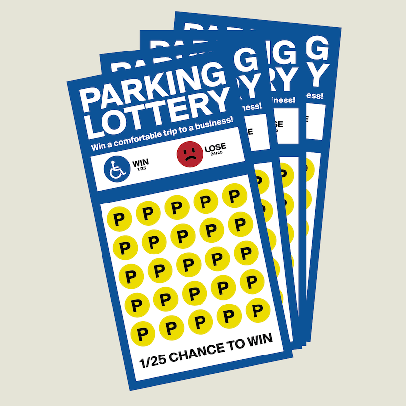
Requirements are often not strong enough. In Chapter 2: Scoping Requirements, Table 208.2 shows that only 2 to 4% of a given property’s parking spaces must be reserved for accessibility.
Sometimes things break, and when they do there are weak provisions for how quickly they must be repaired. The term “prompt action” is used, but there is no specific timeframe listed or required.
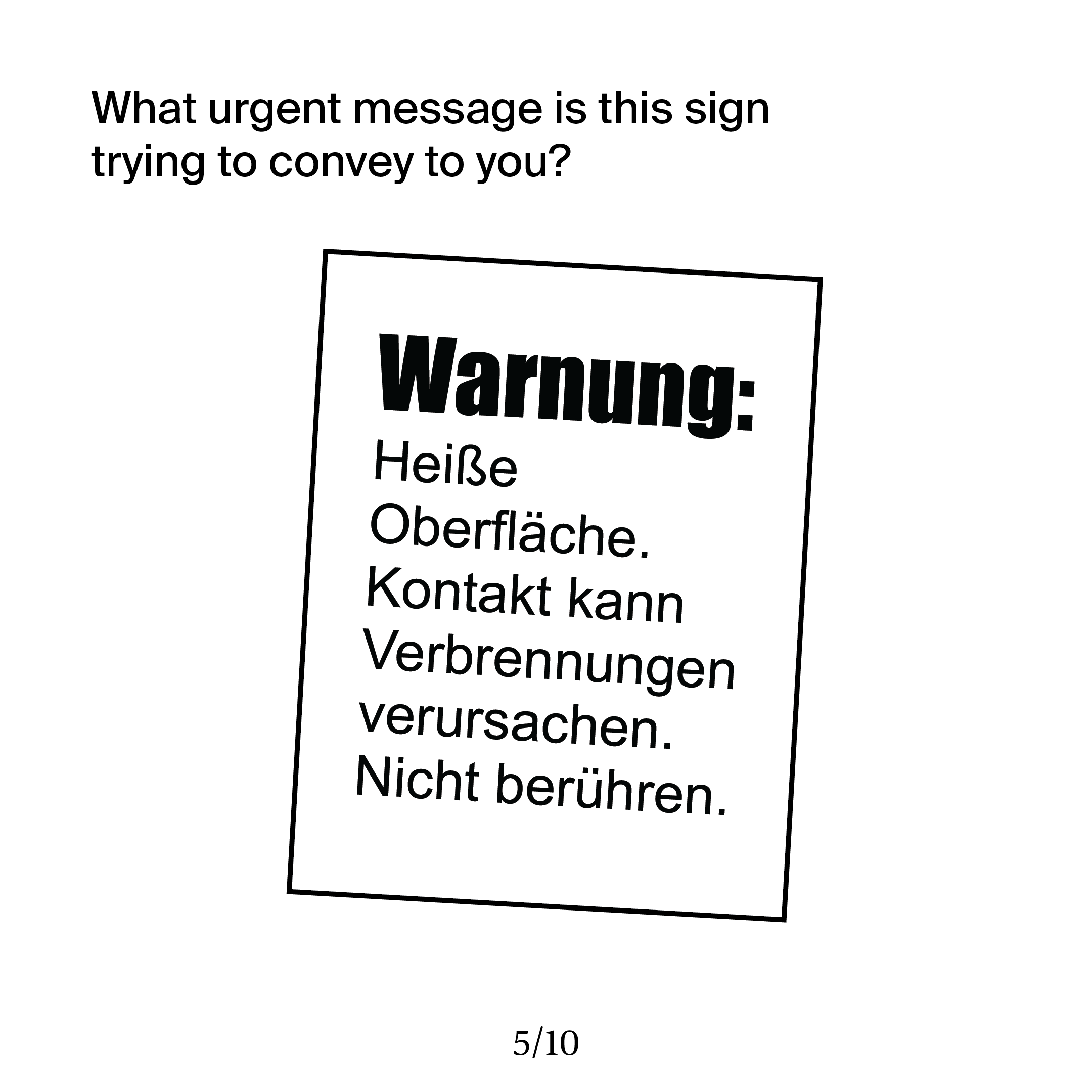
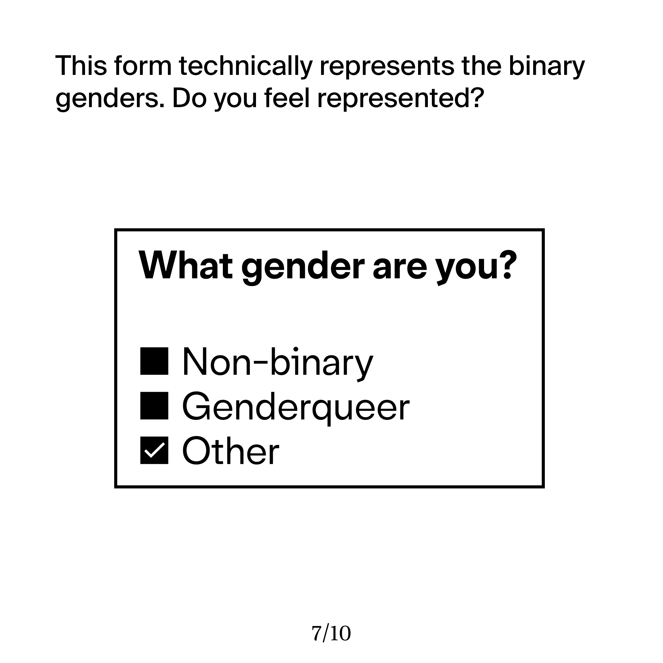
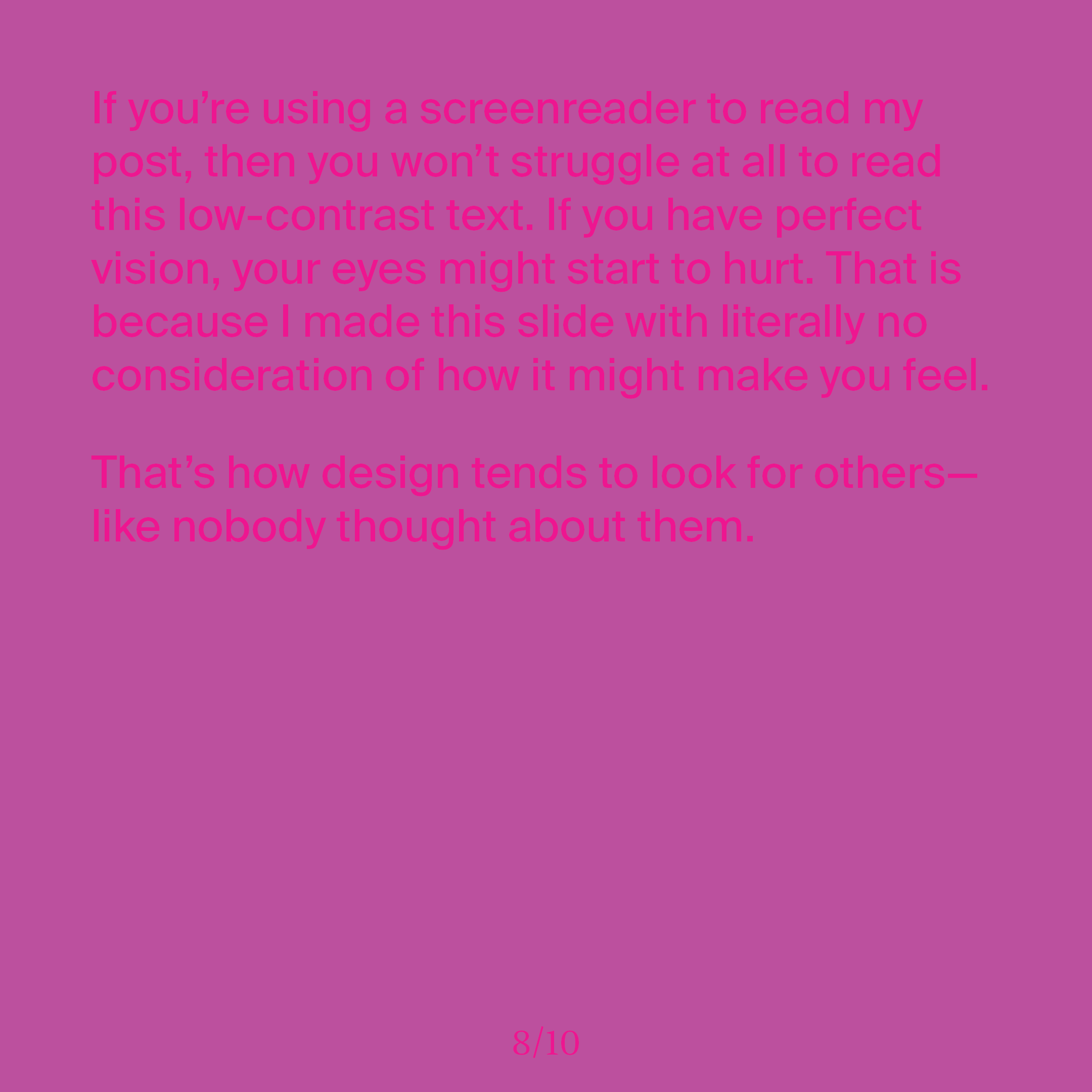
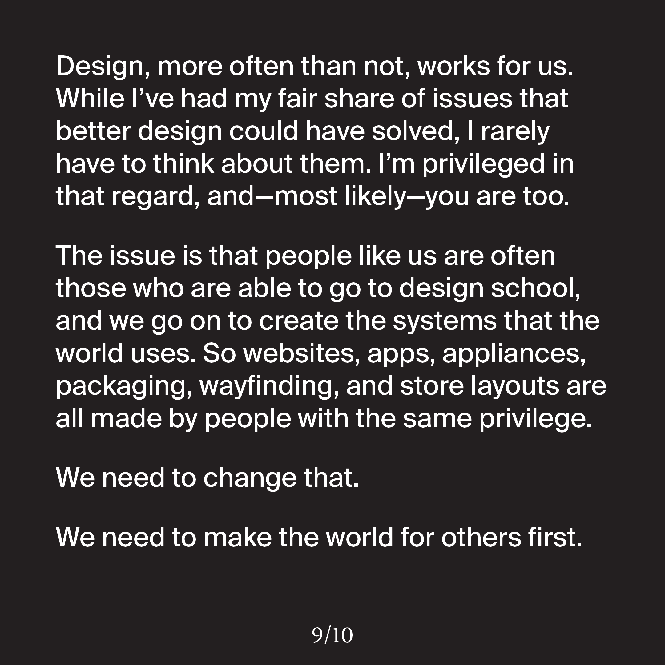
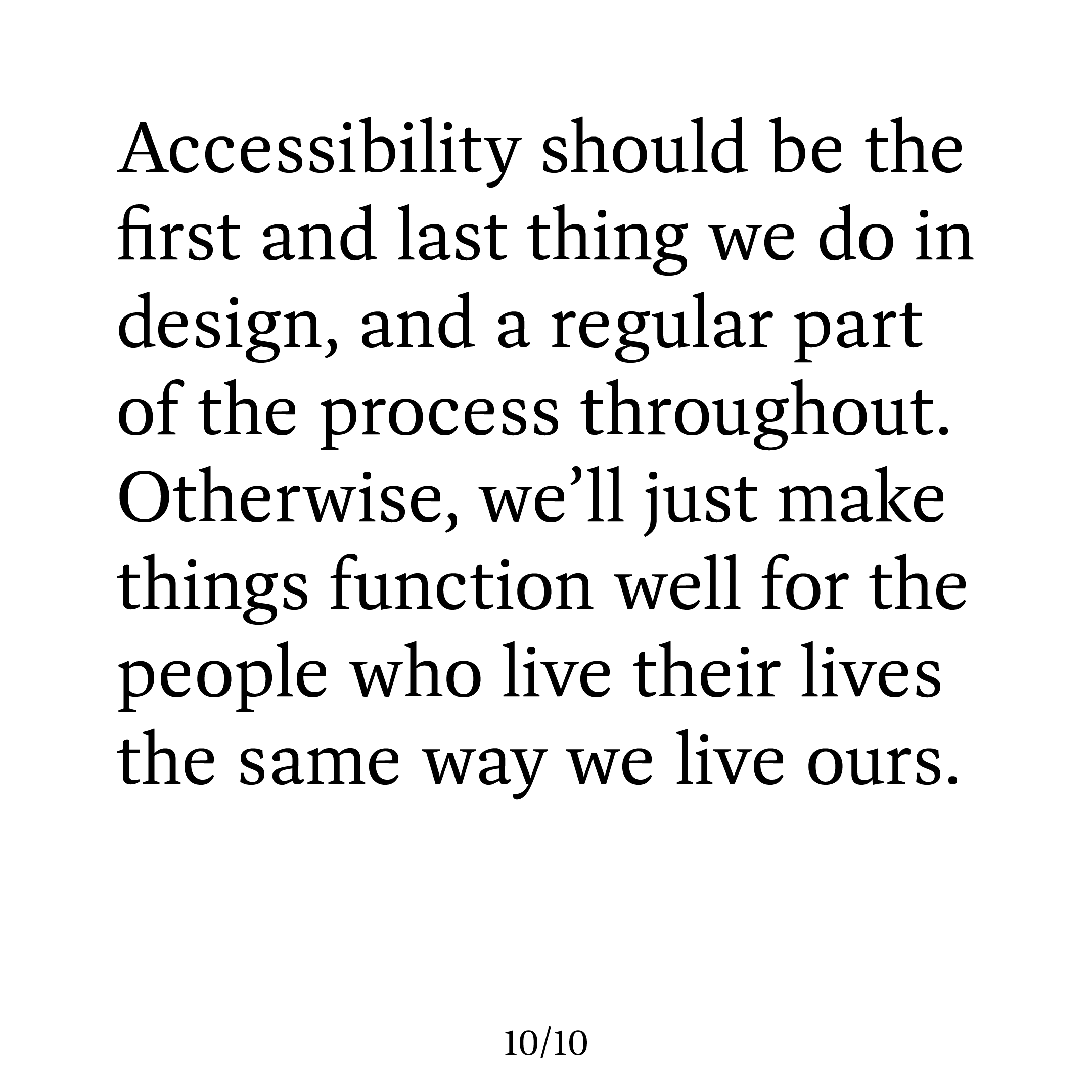
Early into my research, I explored the ways in which accessibility is completely ignored by designers, and created the slidedeck above. I wanted to make one point as loudly as possible—the world is not designed for people with disabilities, and it is impeding their experience with life.
From there, I decided that I wanted to look into what the design process might look like if we considered a group’s disabilities first and foremost.

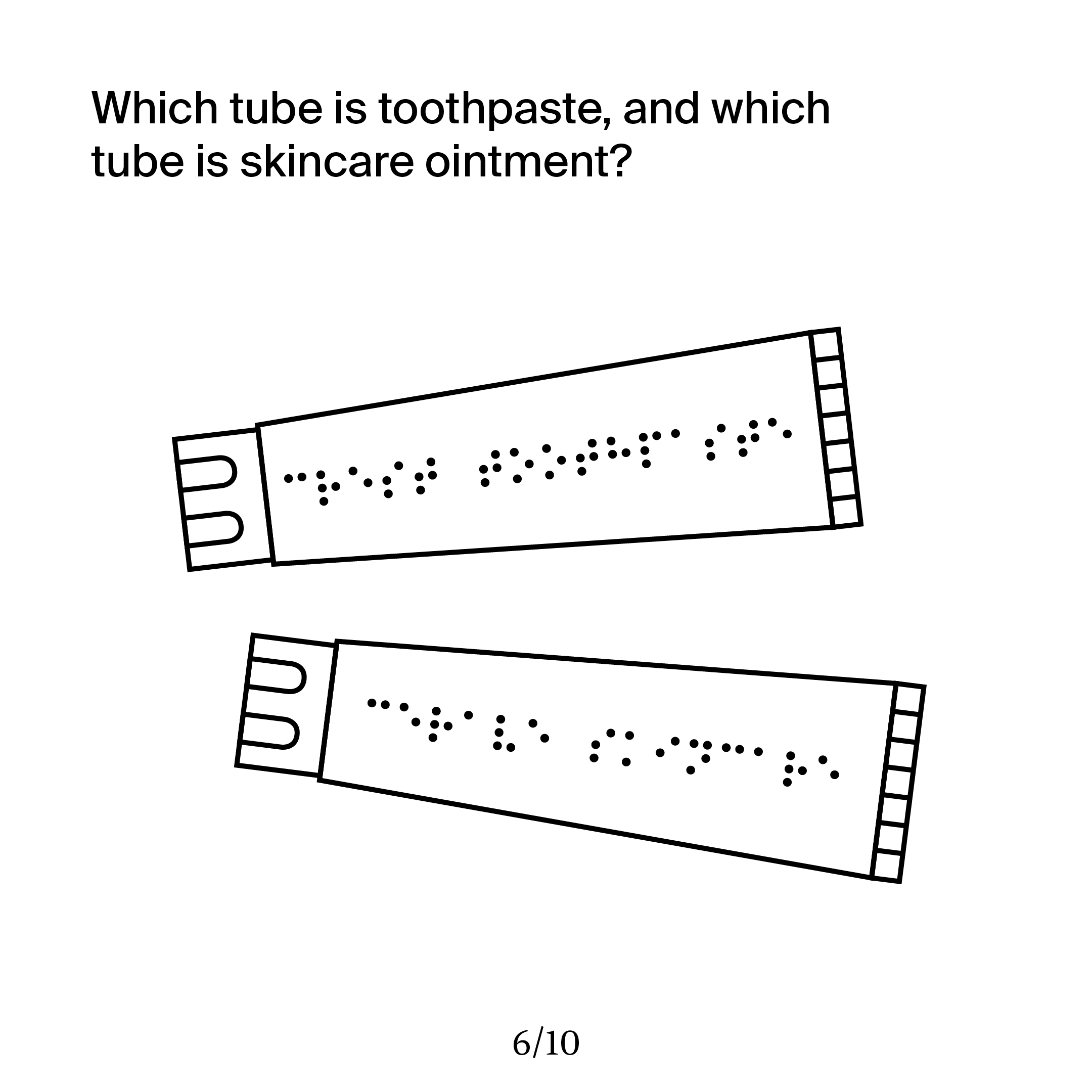
I asked myself a question: how would we design a space to be easier to navigate for somebody who is visually impaired? I started by researching the affliction, and I was surprised to learn that only 18% of people with significant visual impairments are totally blind, and it is estimated that only 10% of totally blind individuals cannot perceive light.
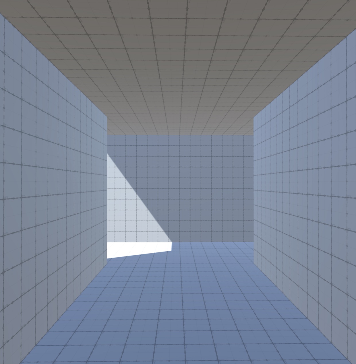
I had a theory that using strongly contrasting colors and light in an environment could help someone who is visually impaired. I opted to create a quick demo in the Unity game engine to see if I could use it to effectively simulate visual impairment.
I started by creating a visual post-processing layer that blurs the player’s vision and lowers the contrast -99% (the lowest the engine allows before losing all distinction).

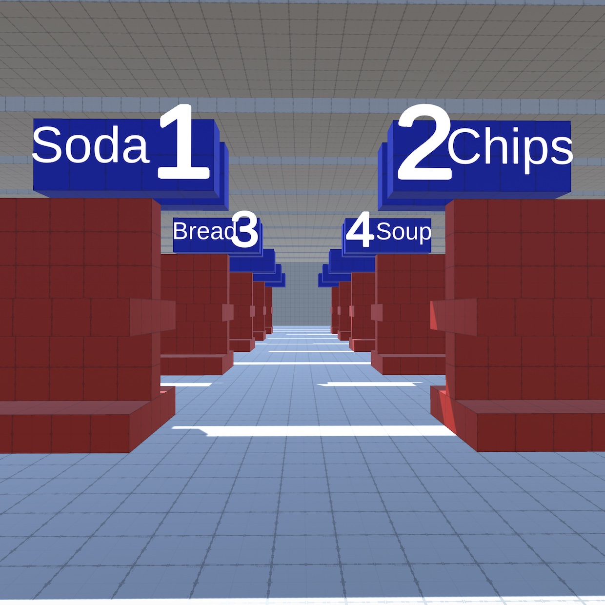
This engine seemed to be working, so I began to think of other ways to implement my design thinking into it. For example, if many blind people can still see some light, how might we use light as navigation?

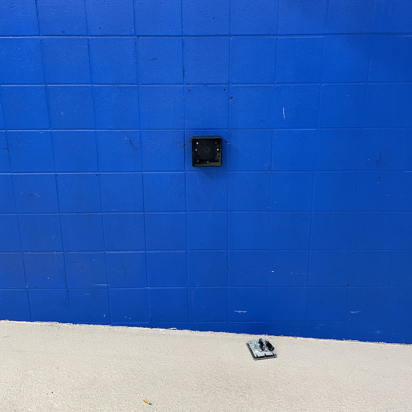
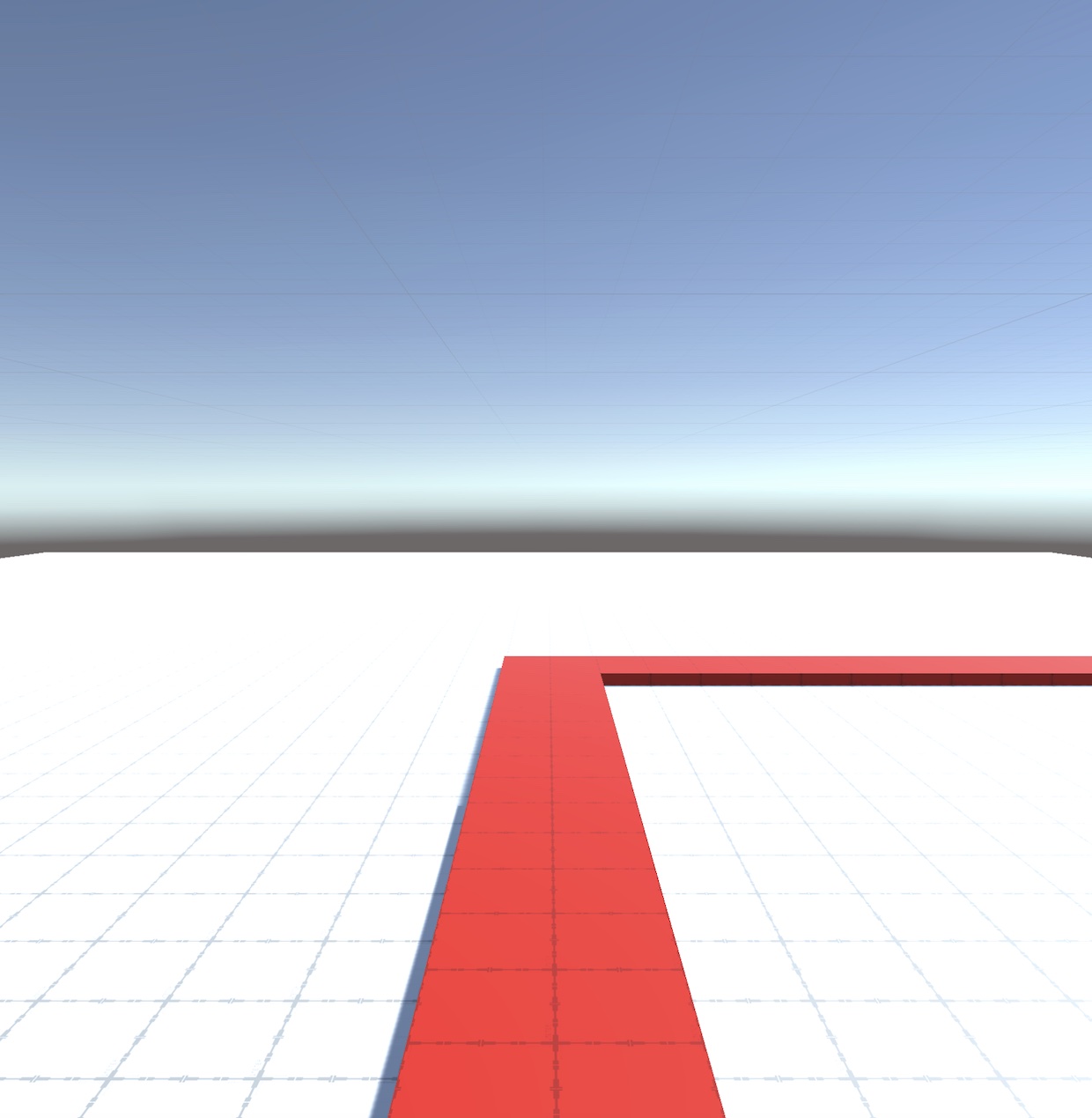
How could we use strong color contrast to create more effective navigational signage? Perhaps a brightly contrasting line such as this could lead somebody to a help desk in a store with a complicated layout.
My research ultimately led me to explore how design thinking could revolutionize accessibility. The journey reinforced the urgent need to consider disabilities at the forefront of the design process. It is my hope that this explorative project inspired my local design community to create inclusive spaces that empower everyone to fully participate in the world they are building as they move into the professional design world.